INDUSTRY B2B
Converging brands towards a new positioning: from brand architecture to website design
THE CHALLENGE
Organize the brand portfolio e change PHC perception in the market
PHC is a Portuguese Software House with more than 30 years of experience. Throughout its evolution, PHC has developed two products that are now commercialised through a network of partners. Although different in some aspects, both products share the main goal of improving the management of PHC clients’ businesses.
In 2023 the company realised they were facing a challenge of brand awareness for the PHC brand and its sub-brands, as a result of having different communication approaches for each product. And so, this was the moment to rethink the PHC Strategy, architecture, positioning and features organization, which should be reflected in a fresh identity aligned with its value proposition.

The process
The first phase of the project consisted of recognising the internal and external realities of PHC. In addition to the market analysis and performance evaluations conducted, our team went through a process of interviewing internal staff from PHC, with several roles and perspectives, as well as partners who could provide insights into customer relationships, internal organisation, and feedback regarding each product.
As a result of this process, we were able to identify 3 key challenges:
1
Tailored communication strategies specifically for each product which resulted in a weak brand awareness for PHC as a company
2
Different value propositions and messaging for each product breaking the PHC brand as a whole and positioning the PHC CS in a higher segment than PHC GO
3
Product Distribution Model that set PHC apart from customers that have a closer relationship with PHC partners
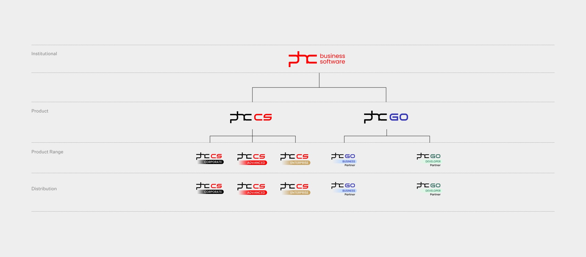
In order to overcome these challenges, we had to redefine PHC’s brand architecture, adopting the company’s brand as the main communication vehicle, and the products as secondary.

Instead of having 2 different sub-brands, the products’ identities were redesigned under the PHC main brand, based on this core identity, and not on different identities distants from the company’s brand:
Once the architecture was redefined, we had to find a strong and consistent positioning to reflect their value proposition. After a market analysis and internal diagnosis, we came to the conclusion that PHC is committed to offer a Better Software.
A Better Software is the final goal of each internal decision and the starting point for all the improvements in a company.
When it comes to the visual identity, the main goal was to freshen up the brand and make it future-proof. The new energetic colours represent the technology, the velocity, the innovation, while the sober ones convey expertise, trust and confidence.
Time
Management
People
Features
Primary Font
Secondary Font
The impact
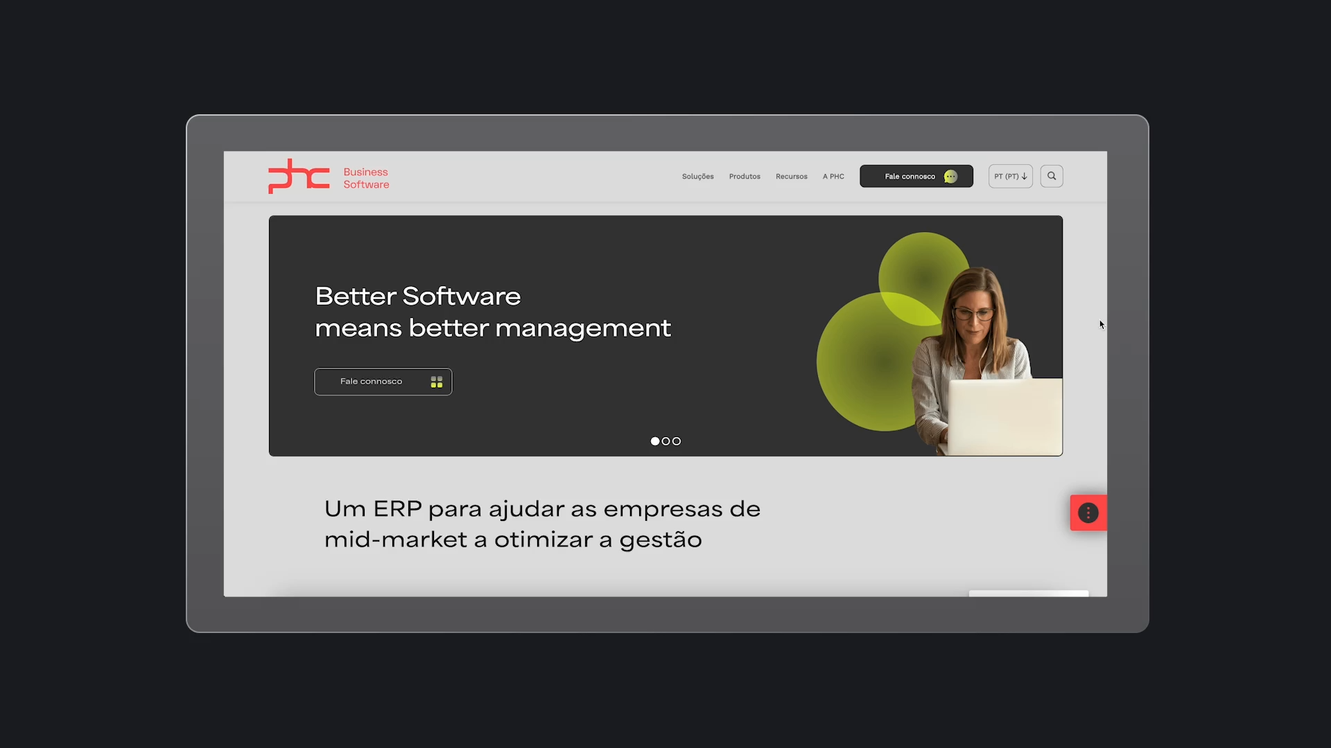
The following step was the design and development of the new digital experience: a new website for 5 geographies. PHC is now offering a better digital journey to its clients and partners, clarifying its value propositon and product specifications.
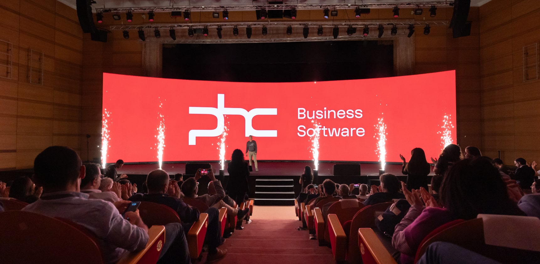
The internal launch event
Once the project was finalised, a great internal event was prepared to announce the changes to all the teams.


