B2B
Defining the group architecture and the new holding’s strategy
THE CHALLENGE
Bringing together different wine brands in the same porfolio
The acquisition of a new wine company by Ravasqueira – a José de Mello Group company – and the possible future acquisition of new companies brought the need to create a holding brand that would unify the different brands and make each of them recognisable as part of the same group, both visually and in terms of communication language.
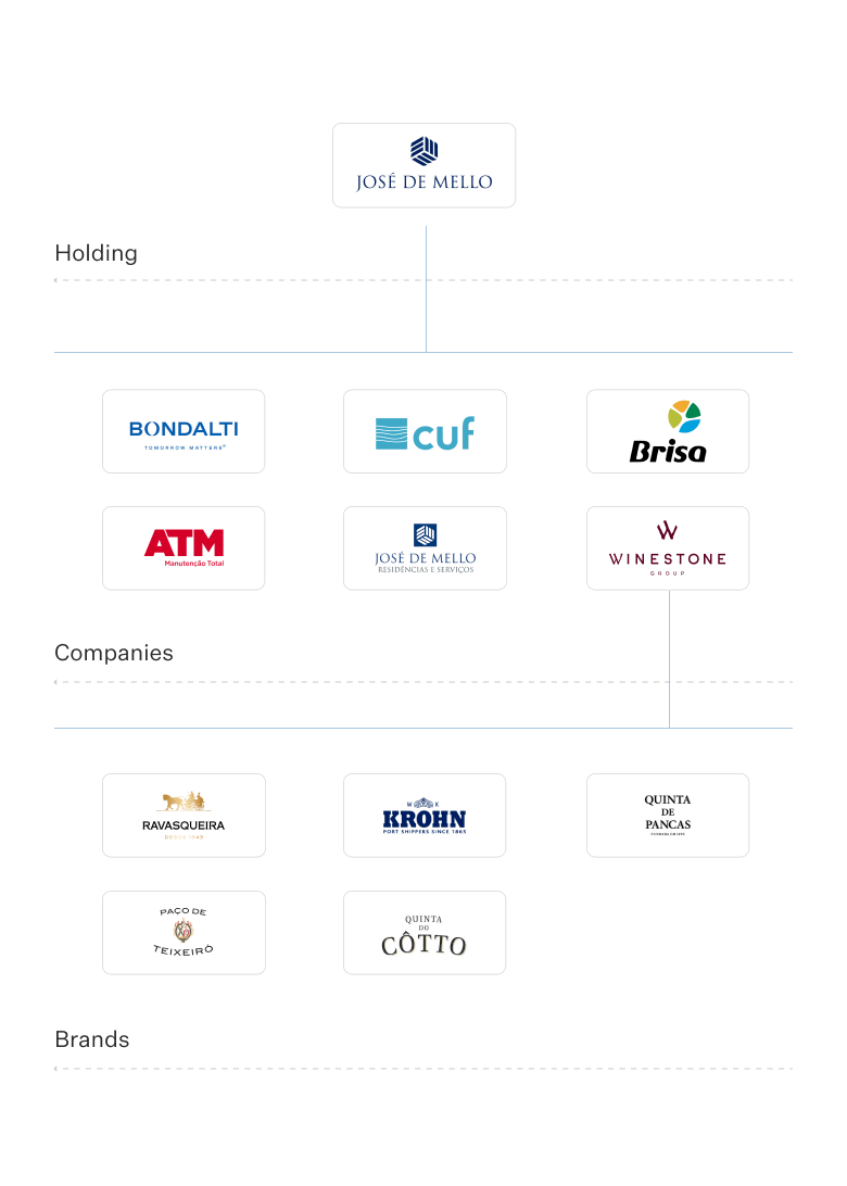

The challenge was that this holding was in fact in the middle of the architecture: from one side, carrying José de Mello Group’s heritage and legacy; on the other hand, it was also pushing the future and innovation values from the new international acquisitions.
The process
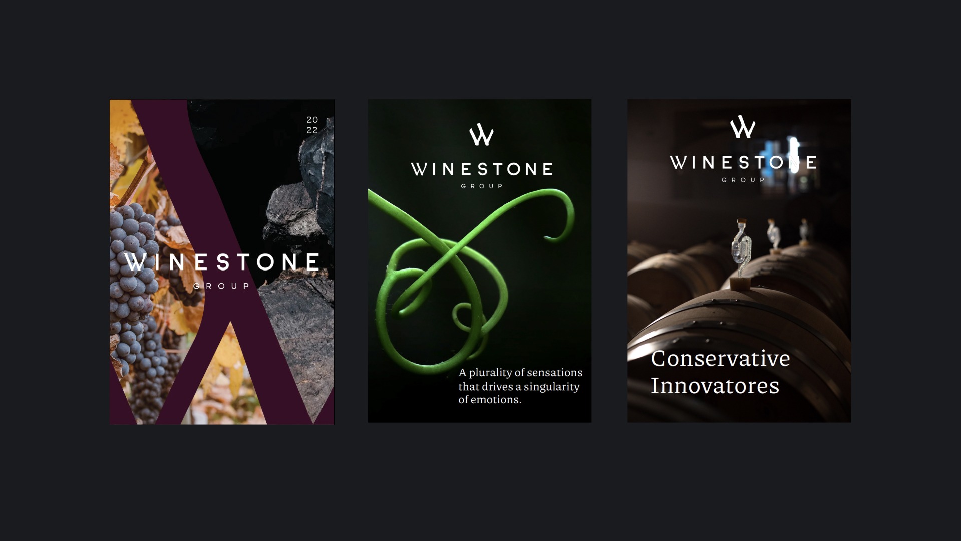
The WineStone Group Brand Strategy was based around three great principles: elegance, subtleness and nature but also around the heritage and confidence that the Group brought to this holding. The purpose was to design a brand that shapes a greater vision: to develop a perfect combination of the art of winemaking, quality, innovation and sustainability with the ability to understand the consumer and approach key markets. And most importantly of all, to create a connection with people through wine.
The first challenge was to understand if the positioning would be familiar (driven by Jose de Mello family), or adopting a commercial approach. That would help to define the name of the holding, that had to be strong, meaningful and robust. WineStone Group name appears as a solid concept: it means that the foundations are deep and strong due to the group heritage, but also invoke the future and the desire of being greater than the sum of its (acquired) parts.



The first challenge was to understand if the positioning would be familiar (driven by Jose de Mello family), or adopting a commercial approach. That would help to define the name of the holding, that had to be strong, meaningful and robust. WineStone Group name appears as a solid concept: it means that the foundations are deep and strong due to the group heritage, but also invoke the future and the desire of being greater than the sum of its (acquired) parts.


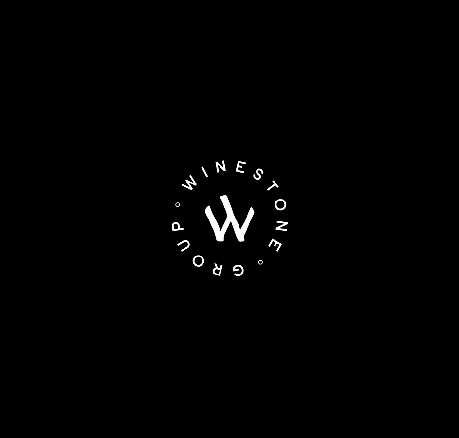
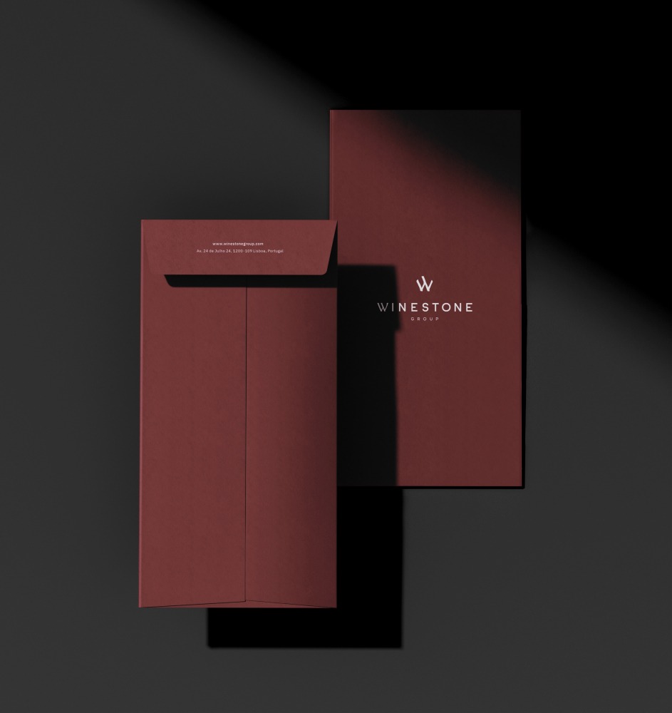
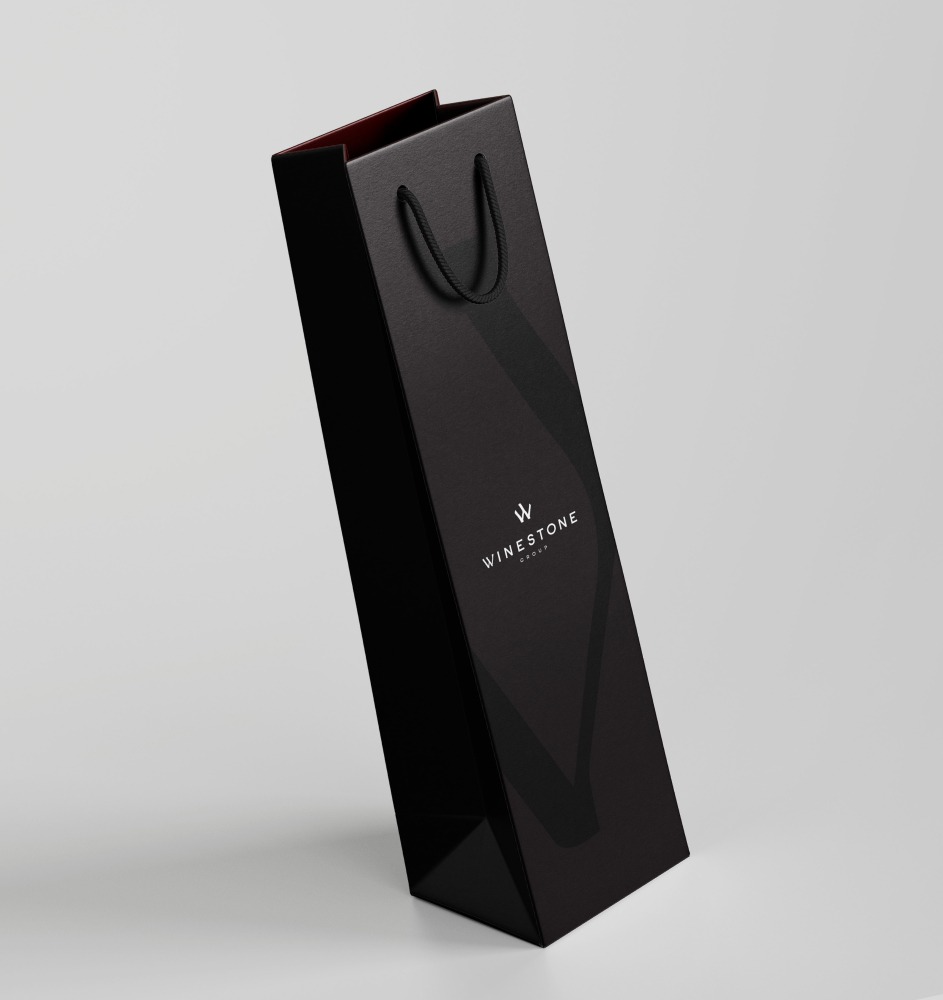
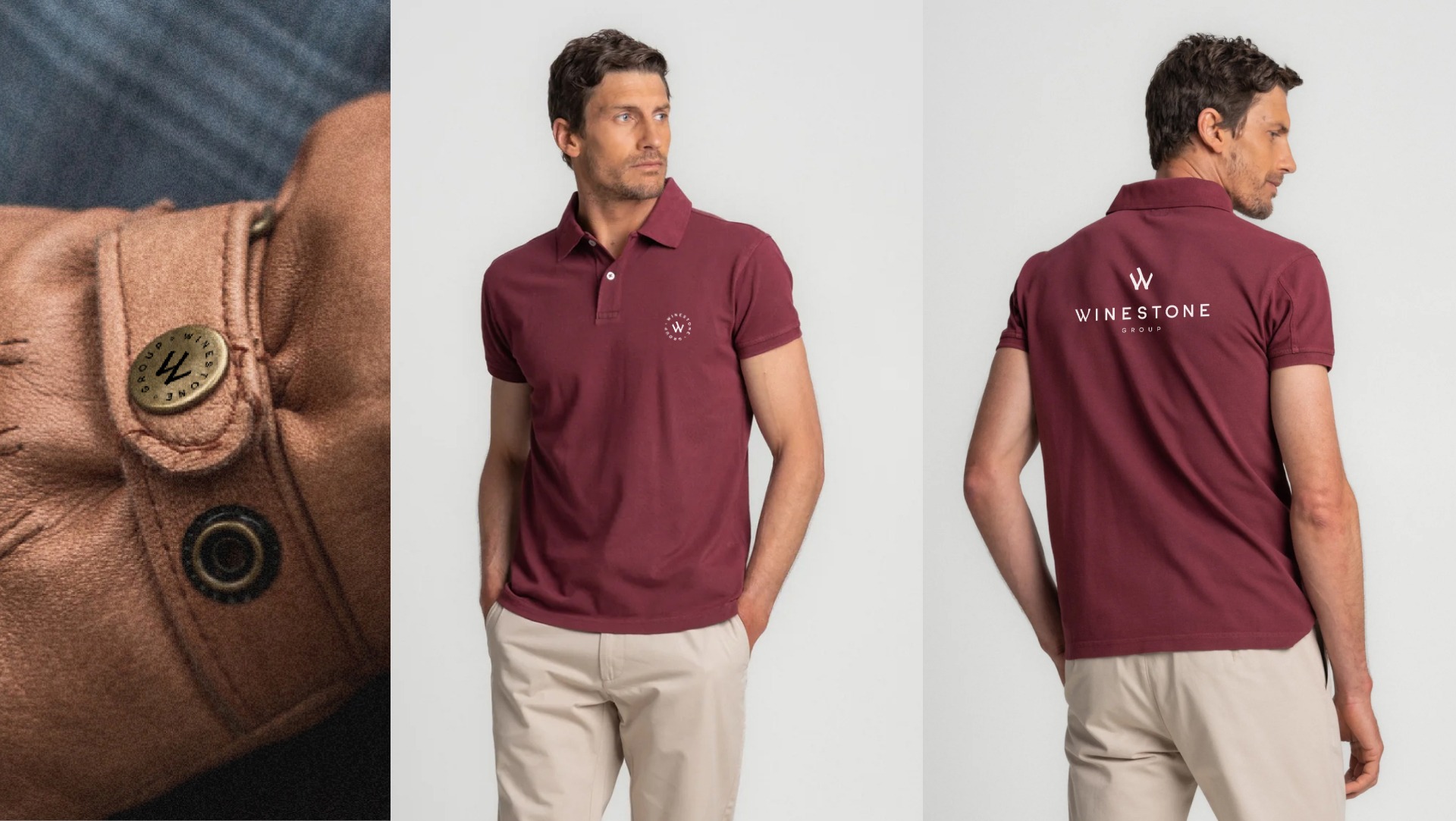
The WineStone W is in the shape of a vineyard, a composition that expresses the connection between the product and the land, the natural world, the territory and tradition.
The impact
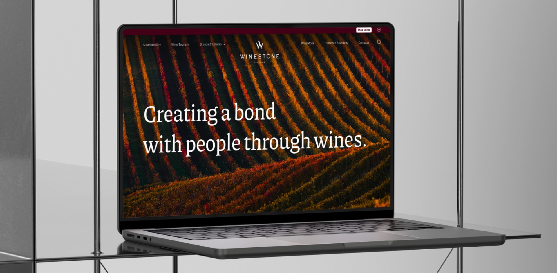
The WineStone Group brand strategy soon evolved to a corporate website. From architecture, to strategy, UX and UI design, copy writing and brand design, our team was part of the process until the launch moment.
